Don is an expert when it comes to design. In his position as a Visual Designer he creates impressive window displays for high-end brands. So, needless to say, he knows a thing or two about how to make the most of small spaces! Over the years, he’s picked up creative design hacks on how to maximize space to create visually appealing displays.
Naturally, his eye for design translates to his home décor, too. This has resulted in his beautifully decorated black and white themed rental apartment. Don’s design tricks have worked to make his 500sqft studio apartment comfortable, functional, and fit his lifestyle. The best part? He’s sharing his insider knowledge with you!

Are you ready to find out Don’s #1 apartment decorating tip?
As a Visual Designer, Don understands the in’s and out’s of what the eye finds attractive. And he used this knowledge to methodically decorate his apartment so it’s as aesthetically appealing as possible.
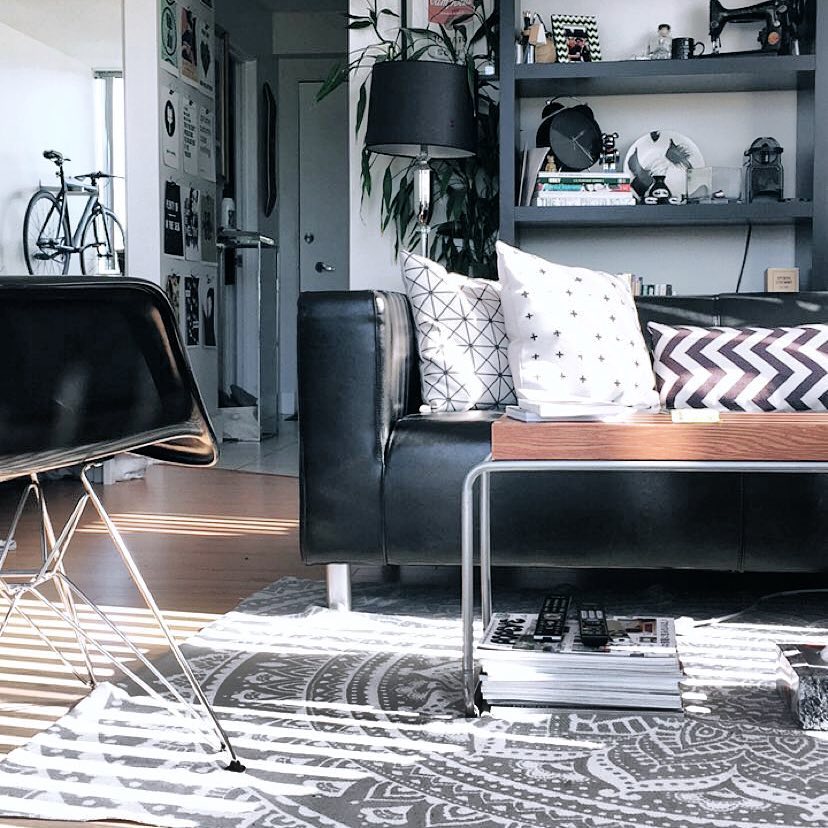
For example, Don chose low furniture to make his studio apartment feel larger and more open. This ensures the sight-lines throughout the unit are not blocked by bulky, over-sized furniture.
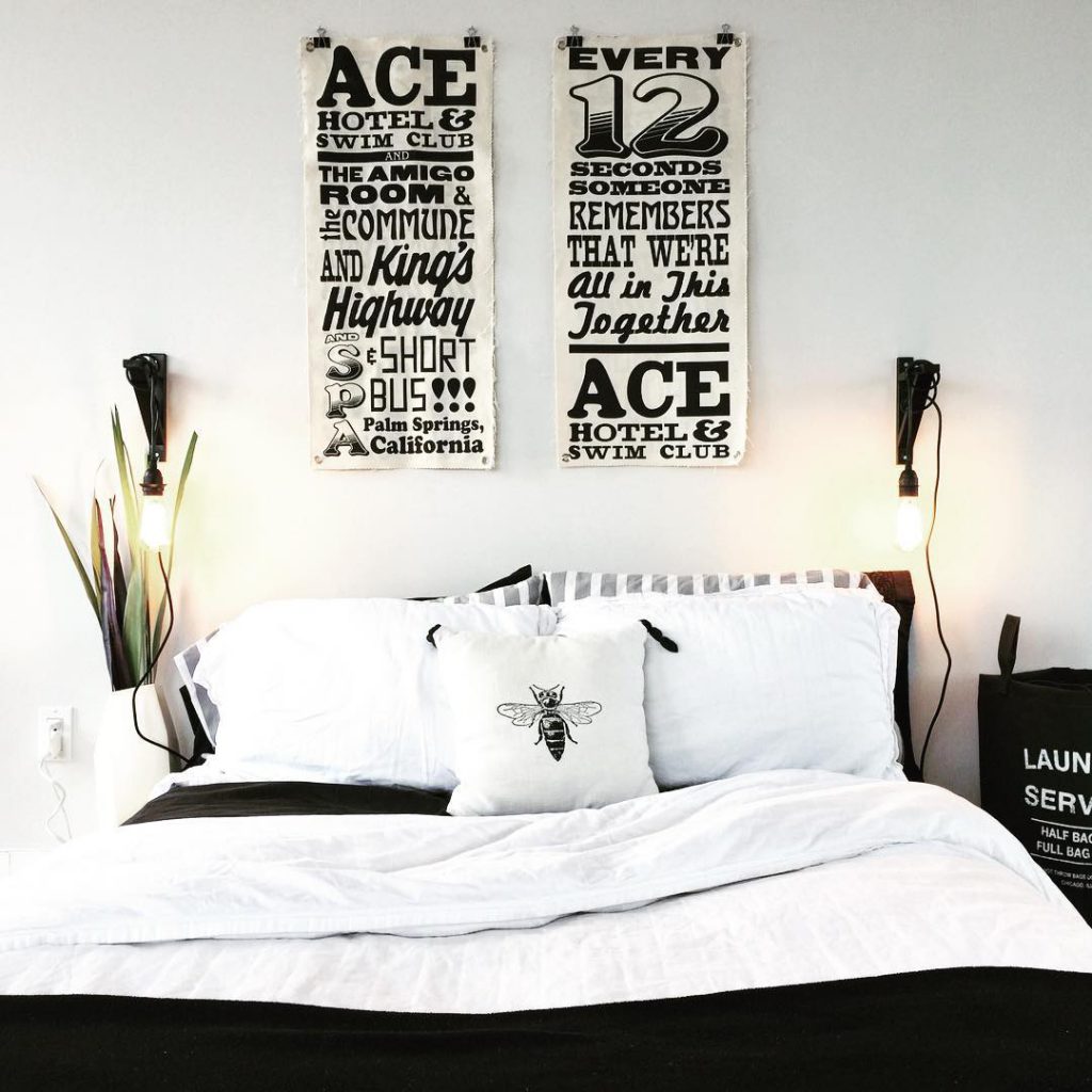
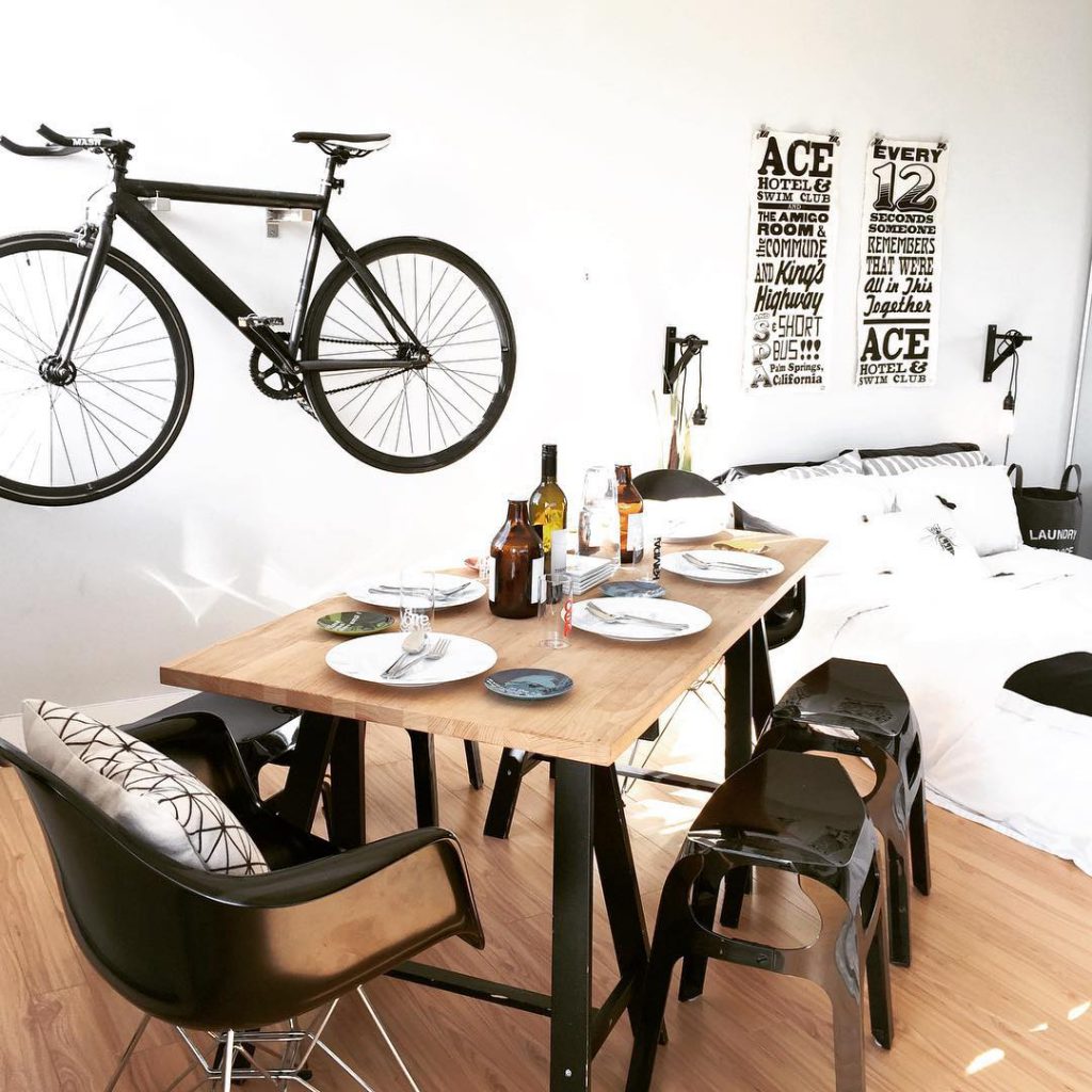
Another example of how Don uses his expertise to decorate is through his artwork. Don selected rectangular artwork to draw the eye up and around the space. This makes for an incredibly unified and streamlined design!
Don’s proficiency with small spaces allowed him to think outside the box with his furniture placement, too. Have you ever thought to put your couch in the middle of the room? Well, Don did…and it actually works! This creative décor hack allowed him to section his apartment into 4 separate areas, clearly defined for sleeping, eating, living and cooking. Pretty impressive for a 500sqft studio!
These tips are great, but his best tip is still to come!
When decorating an apartment, the key is in the details. The placement of picture frames, décor items, and throw cushions can truly make or break the overall design. Don gets this, and that’s why he has carefully chosen unique and inspiring pieces that tie together his black and white theme. But he takes it one step further, and follows the “rule of 3’s.”
Following the rule of 3’s, or other odd number arrangements, has been proven to heighten visual interest and offer a more interesting visual experience. This applies to all things home décor – from gallery walls to bookshelves and furniture placement.
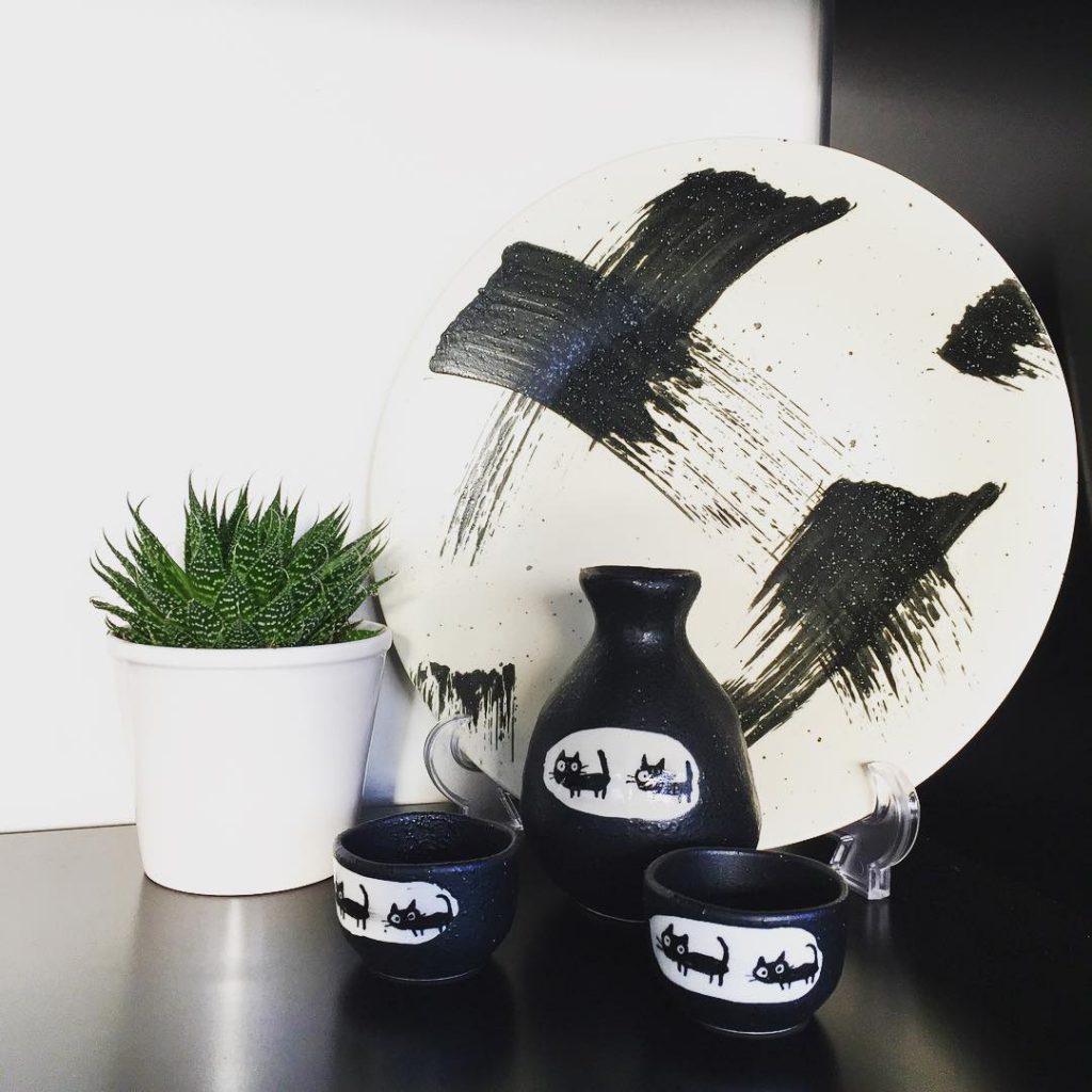
In Don’s bookcase, he used the rule of 3’s twice. Once with the cute cat set, and again with the cat set, plate, and plant.
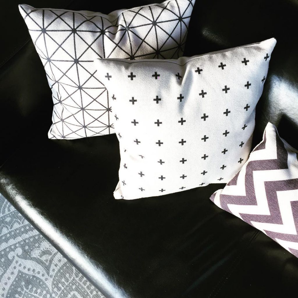
Throw pillows are an easy, relatively inexpensive way to incorporate personality into your apartment décor. They’re also a great way to use the rule of 3’s! Here, Don has added texture and visual interest with 3 pillows, while keeping with the black and white theme, too.
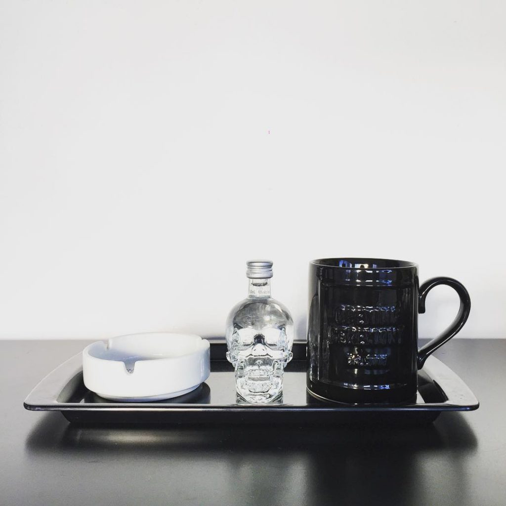
If you have an empty shelf or table that could use a touch of décor, a quick solution is to grab 3 of your favourite things, create a sense of unity by placing them on a tray, and just like that, you have created something fun and visually interesting!
Watch this video to learn how Don uses the rule of 3’s to make his apartment décor more creative.
If you use the rule of 3’s in your rental apartment, we’d love to see! Show off your tricks and tag us using #MyHollyburn on Instagram, Twitter, or Facebook.
Looking for an apartment for rent? Sign up to receive project updates, new, and exclusive insights about our rentals.

